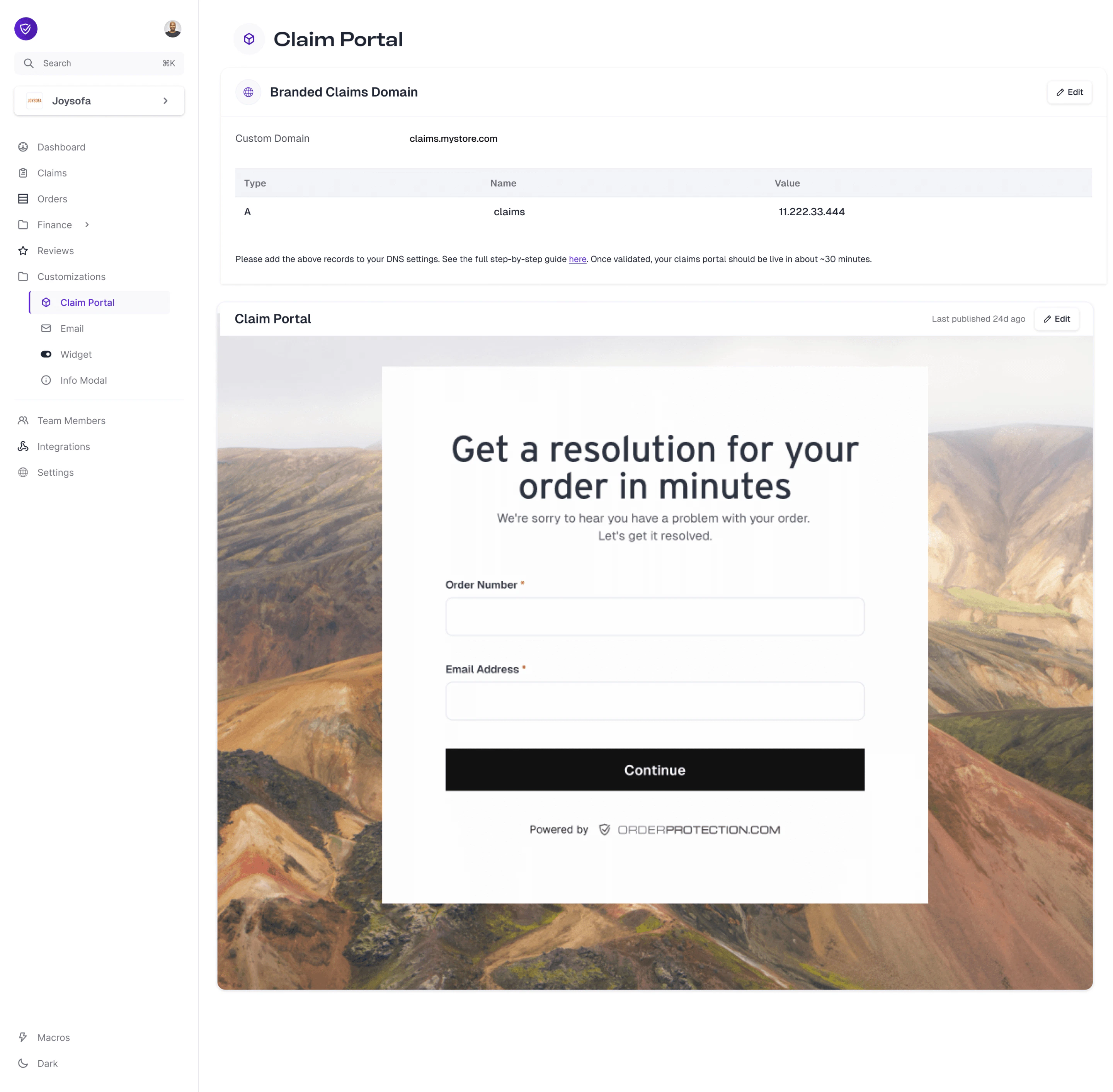
Setting Up Your Custom Claims Portal
Open the Claim Portal tab
Click on the Claim Portal sub-tab. From here, you can manage all of the sections detailed below.
Using the Claim Portal Designer
Once on the Claim Portal tab, select Edit to open up the designer. From here, you can customize each of the sections below. Once ready, hit Publish to see your changes live on your newly configured claims webpage. Not ready to publish? Hit the Save button and come back to it later.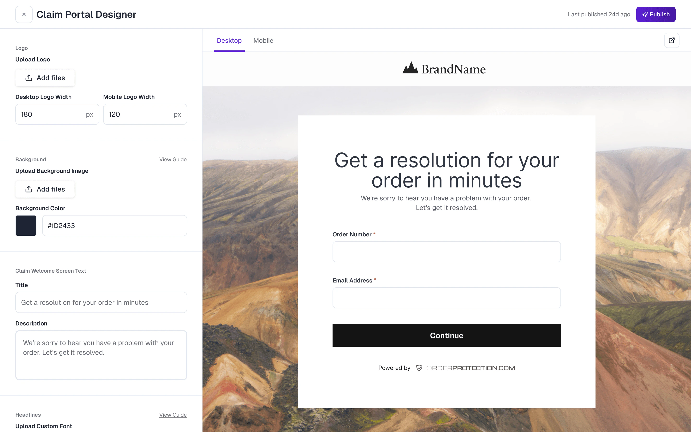
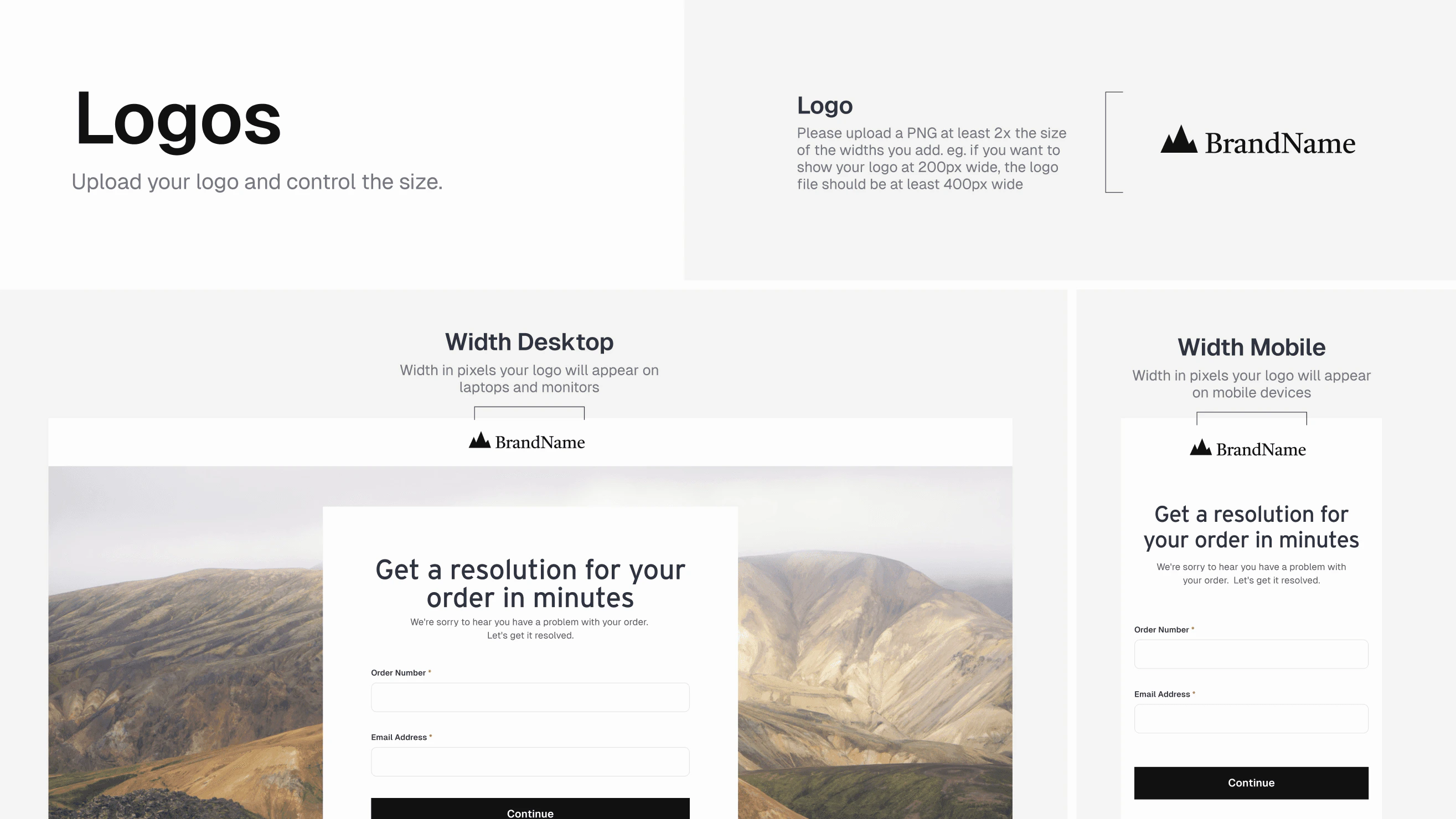
1. Upload Your Logo
- Recommended Dimensions: Make your logo file at least twice as wide as the display size you want. For example, if you want it displayed at 200 px wide, use a 400 px wide image.
- File Format: Use a high-quality PNG with a transparent background if possible.
- Desktop & Mobile Sizes: You can set different logo widths for desktop and mobile to maintain optimal clarity on every device.
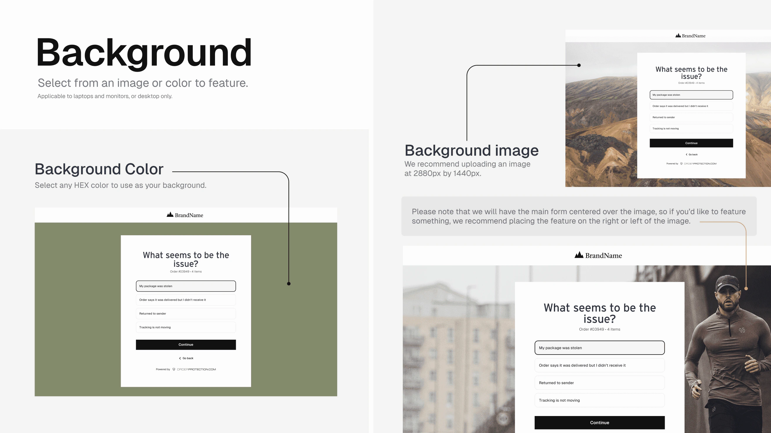
2. Set Your Background
- Background Color: Choose any HEX code to serve as the background behind the main claim form (on desktops/laptops).
- Background Image: For a more personalized look, you can upload a background image (recommended size around 2880 px by 1440 px).
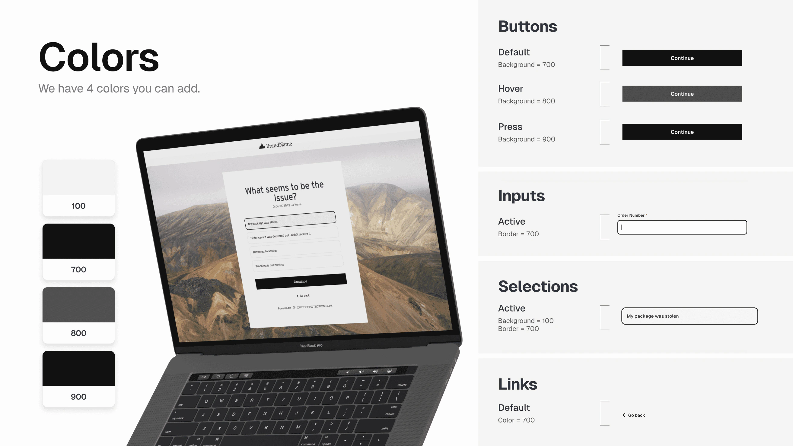
3. Pick Your Colors
You can define up to four custom colors (e.g.,#FFFFFF, #000000, #CCCCCC, etc.) for different elements:
- Backgrounds (e.g., hover states, active states)
- Buttons
- Inputs and selections
- Links
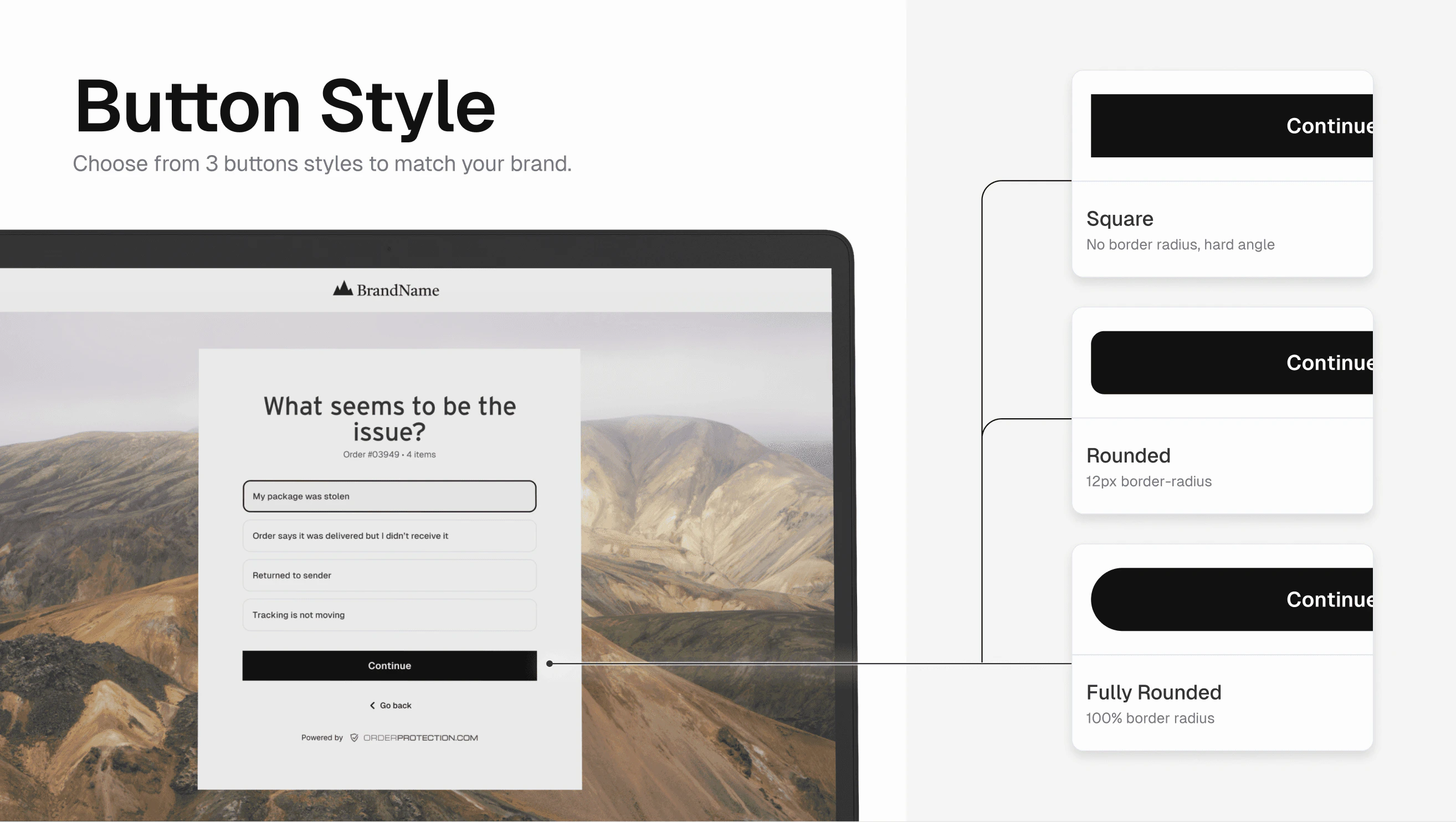
4. Choose Your Button Styles
Shape Options: Square (no border radius), rounded (12 px radius), or fully rounded (circular). Button States:| State | Description |
|---|---|
| Default | The normal button color |
| Hover | Color when the user’s mouse is over the button |
| Press | Color when the button is being clicked |
#000) for default, Dark Gray (#333) for hover, and Light Gray (#555) for press.
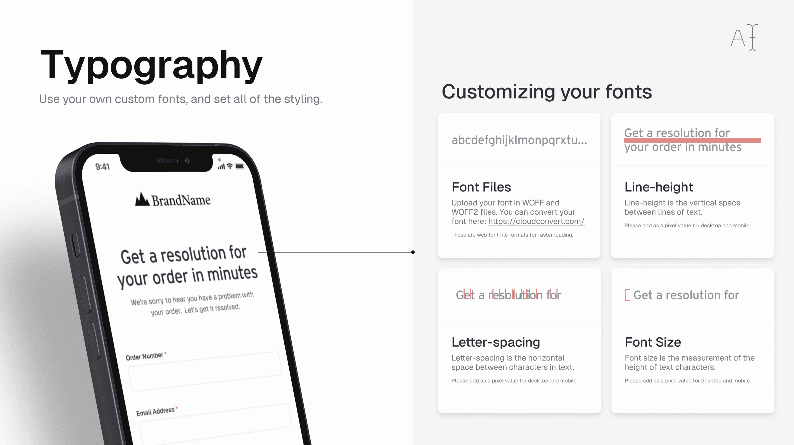
5. Customize Your Typography
- Upload Custom Fonts: We support WOFF and WOFF2 files. You can convert your font to these formats (e.g., via cloudconvert.com).
- Font Size & Line-Height: Control how large the text appears and the spacing between lines.
- Letter-Spacing: Adjust the horizontal space between each character.
- Desktop vs. Mobile: You can configure separate values for each view to ensure optimal readability across devices.
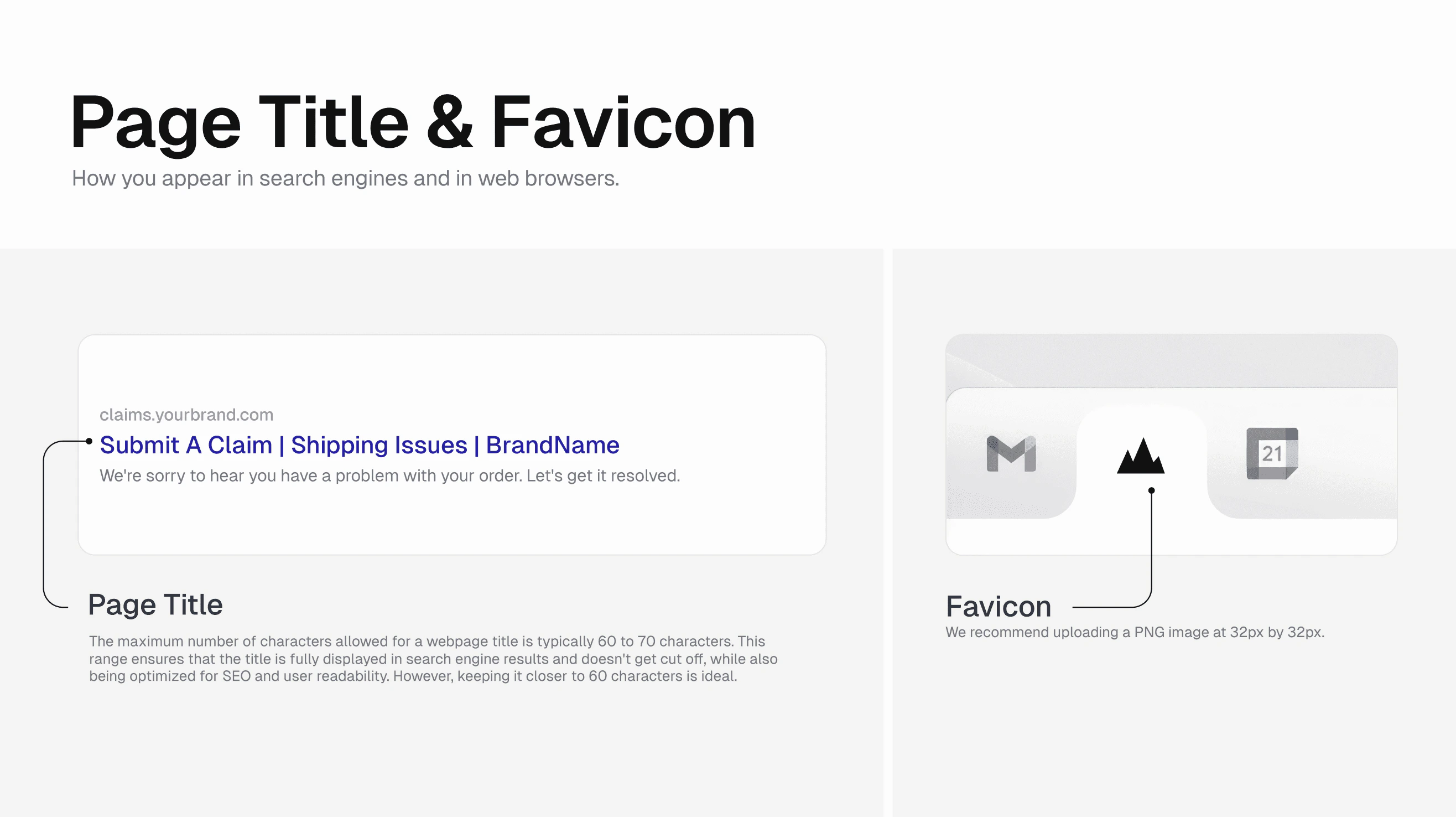
6. Page Title & Favicon
Page Title:- Keep your title between 60-70 characters to ensure it displays properly in search results.
- Example: “Submit a Claim | Shipping Issues | YourBrand”
- Use a 32 px x 32 px PNG (or ICO) image.
- The favicon appears in browser tabs and bookmark lists to represent your brand.