

Before you start
Open Customizations → Claim Portal in the left-hand menu. Two settings live here, outside the designer.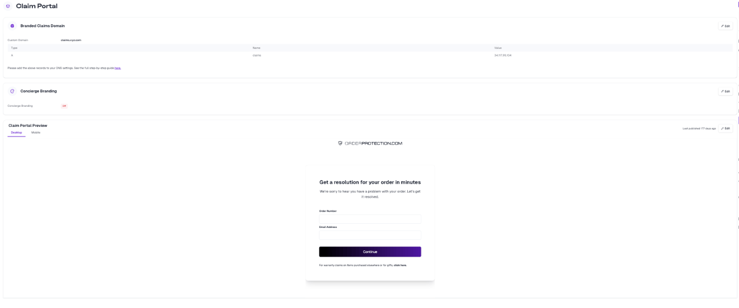
claims.yourbrand.com. Once you enter a domain, the page shows the DNS record to create — an A record pointing at Order Protection’s address. Add it in your DNS provider, then follow the white-label setup guide for the full walkthrough.
Concierge Branding is an on/off setting shown alongside it. If you’re unsure whether it should be enabled for your store, check with your Customer Success Manager.
Opening the designer
In the Claim Portal Preview section, click Edit.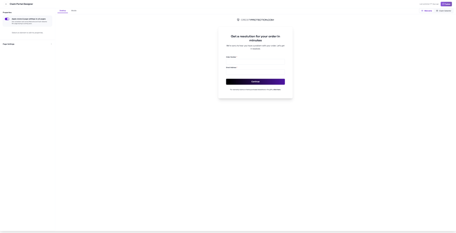
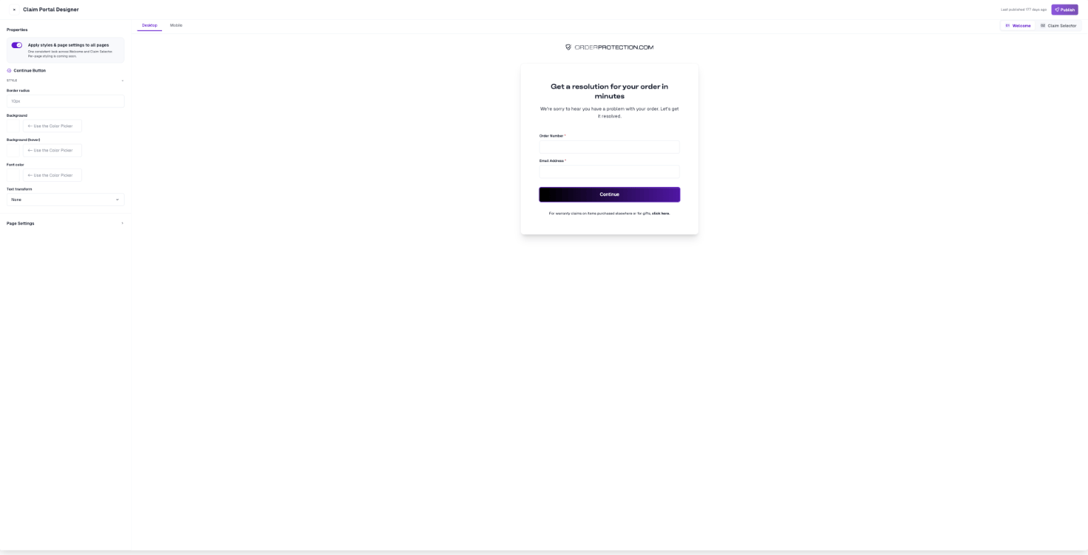
- Properties panel on the left — where the selected element’s settings appear.
- Live preview in the middle — your actual portal, which updates as you edit.
- Desktop / Mobile tabs above the preview — switch which breakpoint you’re designing.
- Welcome / Claim Selector switcher on the right — the two pages of the portal.
How editing works
Click any element in the preview. It gets a highlight ring, and its properties load in the left panel. With nothing selected, the panel reads “Select an element to edit its properties.”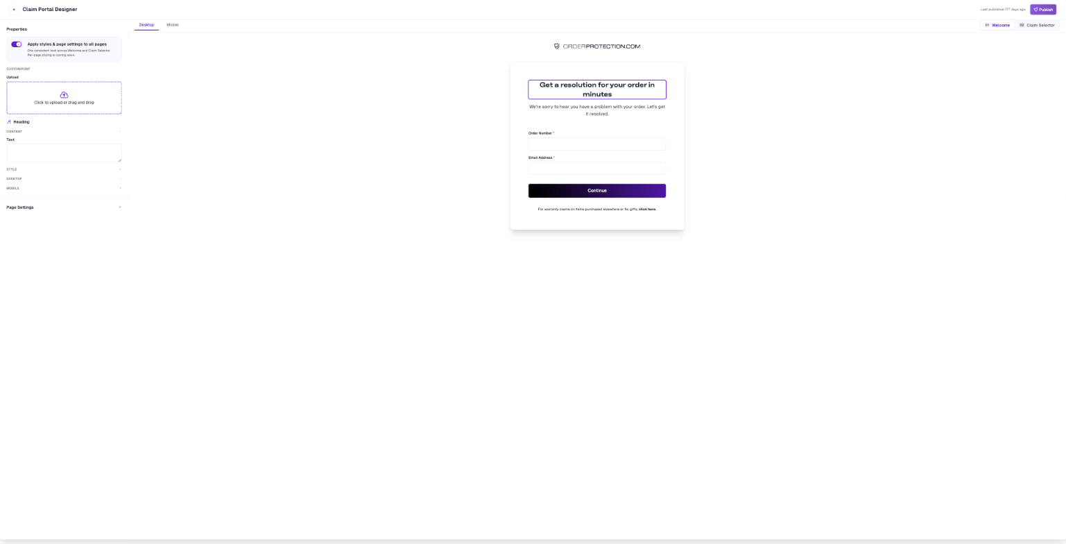
Text elements also show a Custom font uploader above their properties.
The portal’s layout is fixed. You can restyle and rewrite the elements that are there, but you can’t add, delete, or reorder them.
The two pages
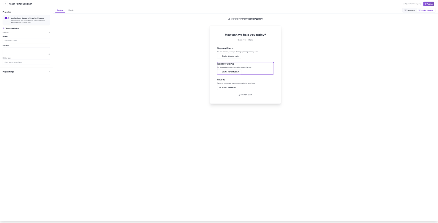
Use the switcher above the preview to move between them:- 01 Welcome — where customers enter their order number and email.
- 02 Claim Selector — where they choose what kind of claim to file.
What you can edit
Welcome page
Claim Selector page
Page Settings
Page Settings sits at the bottom of the properties panel and applies to the portal as a whole rather than to one element.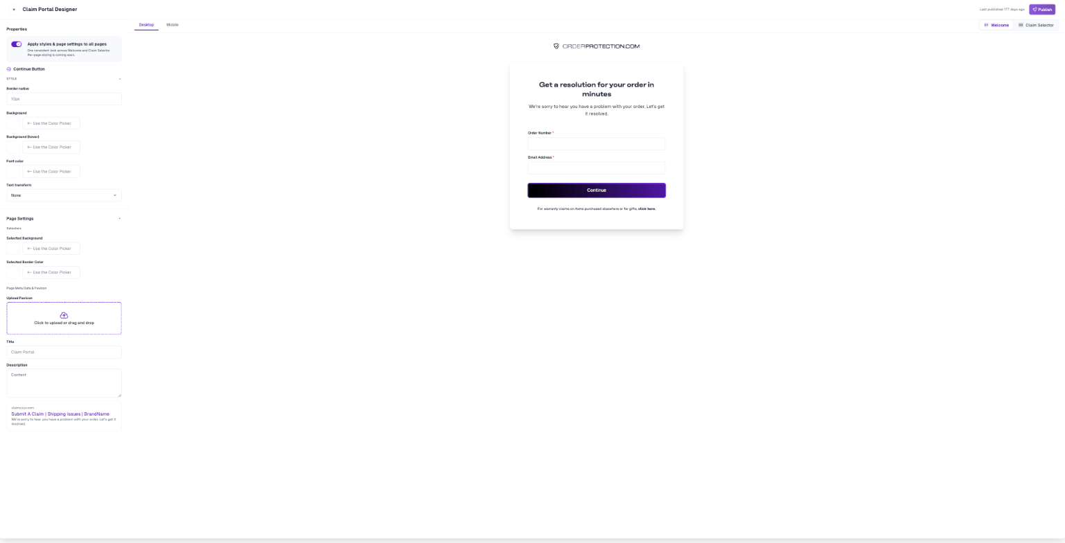
- Selected Background
- Selected Border Color
- Upload Favicon — a small square image, typically 32 × 32 px.
- Title — keep it to roughly 60–70 characters so it isn’t truncated in search results.
- Description — a short summary, under about 160 characters.
Page Settings is edited from the Welcome page and applies everywhere. On Claim Selector the section is disabled.
Designing for mobile
Switch to the Mobile tab to see the portal in a phone frame. Font size, line height, and letter spacing are stored separately for each breakpoint, so set them on both tabs — changing desktop type won’t change mobile. Logo width is also set independently for desktop and mobile.Fonts
Each text element has its own Custom font slot — heading, body, and sub-text are separate typefaces. Each slot accepts a single.woff or .woff2 file. If your font is in another format, convert it first.